TBCave.com
My $.02 worthy of a wooden nickle.
Agreeing with me will give you gas.
HDR (High Dynamic Range) takes three snapshots. Underexposed, "properly"
exposed (normal), and overexposed. It then combines these three to mute out
(provide detail) high whites and darks to give you a better exposure overall.
Now, this may or may not be desirable. Typically, HDR photos as taken on
an iPhone aren't as soft (good shadow to emphasize something) and warm
(darker colors).
Where HDR shines is taking a pic of something in harsh light or where
there are a lot of shadow areas (not black holes, just shadowy). If you
want to compare "normal" to HDR, take a picture from a few different angles
of a bookcase with lots of items on it. In the normal pictures, you'll
notice a difficulty in determining color in shadow (like the spine of a
book) or the undersides of shelves cloaked in shadow. In the HDR pic,
you'll be able to determine color much better and while there will still be
some shadow, it won't be as opaque as the normal picture and you'll be able
to see detail that's not visible in the normal pic.
It's not magic. HDR isn't going to turn all your photos into National
Geographic material. For that, you'll need to practice and learn how to
take good pics. For those who are photographers, sorry for all the lay
terms. I'm not a photographer. I usually take good pics and sometimes I get
lucky and take a phenomenal pic, but I'm definitely not a photographer by
any stretch of the imagination.
Just FYI, you can't have HDR on and flash on at the same time. Enabling
one will disable the other. FYI two, if at the top it says HDR On, then it
means HDR is On. You'll know it's on because after taking the pic it'll say
saving HDR.
My personal preference is not to turn off the setting to save the normal
pic and the HDR pic as it gives me the option later to choose which I like
best. Slows things down while taking pics as it has to save both, but I can
live with that.
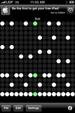
 FREE - For those of us who remember .MODs, .669s, .XMs etc, you'll know exactly
what you're doing here. It's like a little 16 track MOD tracker with only
one instrument and your tune can only be about four seconds long.

Even with these limitations, it's surprisingly entertaining especially
when you discover the social aspect of being able to anonymously share your
catchy little creation with other users. You can upload and download tunes
and even save them locally for quick access later. When you upload a tune
you give it a name others will see, but it assigns it a random five
character code you can share with friends so they can download your totally
awesome creation. What's really nice about TonePad is that you don't have
to be musically inclined in order to enjoy this.
You'll see serious tunes, tunes made from people's initials or little
pictures (some childish or adult in nature). At any rate, you'll find
yourself lost in this little time waster pretty quickly.
Here's the codes for a few of my tunes: WXZPY, FMXLW, GPGNQ and AOSBI
 Wow! The Apple MaxiPad is about as magical as my cup of coffee. Seriously!?!
A big fat iPod Touch with 3G for some extra coin? A Kindle killer for sure,
but a Netbook killer? Hardly.
If it was a toned down OSX Snow Leopard with a camera for video conferencing via
iChat or Skype, then I would have been more excited. Maybe I was expecting
too much. At least a little multi-tasking. Something like an IM client on
the side while doing something productive in iWork, or Pandora even.
I have no doubt that this will sell well. I can even see this being a big
deal in maybe the medical field where it's all Star Trek like patient care.
For me though, I can't really see it being of much benefit. If it had been
introduced in reverse, first the MaxiPad and then the iPhone, I could have
been really excited. Like we'd been used to the iPad and then Apple said,
"We know you love your iPads, but what if we told you that you could
have that same wholesome goodness but in a pocket sized package and ...
<gasp> ... It's also a cell phone!!!" Now that would have had me all giddy
inside.
 FREE - I have no affiliation with Chompapps.com.
Don't know 'em, not married to any of 'em, didn't father any children with
'em. This is just me and my big mouth.
Chomp is a social networking review site with Twitter tendencies. It's like
Twitter because you have followers and people you can follow. You can't
message each other like twitter, but based on conversations I've had with
Cathy Edwards at Chompapps.com, that'll
soon change.
I'm hoping Chomp will be a better review system than what exists at the
Apple App Store which is full of shill reviews and people who have no idea
how to use what they've just installed.
Unfortunately, I've noticed some things about certain Chomp reviewers that
has me a bit worried. Worried enough that I decided to write up what I think
should be a Chomp Reviewer's Code of Ethics. Worst case, they're at least
my ethics so when you see a review from LDGREGORY on Chomp you'll know
where I'm coming from. Note, I'll be using the word iPhone to generically
cover iPhone 3G, iPhone 3GS and iPod Touches.
 If you haven't installed the app on your iPhone or at least used it for
a reasonable amount of time on someone else's iPhone then please don't
review it. I took this so far as to say if I have used the full version but
didn't actually try the LITE version, I won't review the LITE version.
 Please, pretty please! Don't shill here. Give us mortal users one last
bastion of sanity to try and find really great apps. Think of it this way.
If you have to shill your app, it probably needs some work. A great app
doesn't need shilling. You'll have us lining up at your door by word of
mouth.
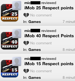
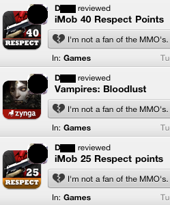
 Some apps, typically the MMOs, offer apps which are essentially the base
app with some number of in-app spendable favor points. If you
reviewed the base app and then go and review the 10 point, 20 point,
and 40 point versions of the app, it becomes painfully clear you're just
whoring up your number of app reviews. Think about it. If you said you
liked the base app, what does also reviewing the 10 point version prove?
Yep, you got it. Nothing.

 I can understand if you don't leave a comment for an app you liked, but
if you decide to give an app a negative review it only makes sense to
say why you didn't like it. What if your reason for not liking it means
absolutely nothing to the next guy who's thinking about downloading it.
They might not download it based on your negative review which was given
because you didn't like the fact that the app didn't do landscape mode.
 Just because you like app X over app Y which do basically the exact same
thing, there's no need to bash app Y with a negative review. You should try
to rate an app on its own merits. I'm not saying don't compare apps. Heck
no, just the opposite. If you know of a better alternative, I'm all for
putting that in the comment. But just because you chose Stanza over
eReader, does that really make eReader a poor eBook app deserving of a
negative review. C'mon, I know you've got enough love in your heart to
actually give both of them a good review. Nothing saying you can't leave
a little caveat comment in the positive review for eReader.
 When you write a review, what are you really reviewing? One thing I hate
is when I keep seeing people who give an app a negative review and in
the comment write something completely inane like "MMOs don't really do
it for me". Uhhhmmm, ok. So you don't like MMOs. But for those folks who
do like MMOs, exactly how useful is your review to them? Is it going to
help them decide which Mobster game has the best overall gameplay and
feeling of accomplishment? Nope. All you did was whore up your app
review count.

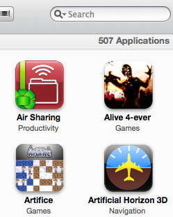
 Finally, It's about quality, not quantity. Follow people who like apps you
like, not for the number of apps they've reviewed. I received over ninety
followers in about 1.5 days worth of reviewing 250 apps. I'm hoping that my
followers are following because they agree with my reviews, not because I'm
an app review whore. I've still got a long way to go as I've only reviewed
less than half of the apps I have sitting in my iTunes so far.

 I realized today that while I own and manage quite a few different websites,
that I really didn't have any place to just sorta blog (eww, ewwww, ewww, I
just said the 'B' word! LOL!)
Just a wild guess, but this place will be mostly about iPhone stuff.
I have a site about my truck, I have a site about other people's trucks, I
have a site for each of my girls, I have a site for computers and technology.
This will be my site where I can just whine.
I also decided to make this site purely for the smartphone platforms. You
can still look at it on a desktop or laptop but it'll look pretty lame for the
most part. Since I have an iPhone that's what this site is designed for.
Once I get it tested on a few other smart phones, like the Android, I'll
tweak it to work well on them too.
 If you're on an iPhone, scroll up to the top and rotate the phone to
landscape for some fun WebKit tricks. Hint: Look under the URL graphic.
What does TBCave stand for? It's a domain I bought a long time ago for
another project and never did anything with. It was going to be The Bat
Cave. Now? Got me.. Maybe The Butthead Cave.

 If you haven't installed the app on your iPhone or at least used it for
a reasonable amount of time on someone else's iPhone then please don't
review it. I took this so far as to say if I have used the full version but
didn't actually try the LITE version, I won't review the LITE version.
 I realized today that while I own and manage quite a few different websites,
that I really didn't have any place to just sorta blog (eww, ewwww, ewww, I
just said the 'B' word! LOL!)
 If you're on an iPhone, scroll up to the top and rotate the phone to
landscape for some fun WebKit tricks. Hint: Look under the URL graphic.